AetherCorp Project
Top-Down Shooter Game
-
Role: Narrative Design / Art / UX
-
Team & Time: 3 people · 9 weeks
-
Engine: Unity

Introduction
AetherCorp is my freshman project. It's a top-down space shooter made in Unity. You play as a human pilot fighting back against an alien colonization to save the Human Federation before it collapses.
The game is structured around three major boss encounters—each alien mothership has its own signature mechanics and attack patterns, so every fight asks the player to learn and adapt. It’s a fast, arcade-style experience focused on tight movement, clear combat feedback, and the escalating pressure of a last-stand war in space.
My Roles:
I worked on Narrative Design, Art Design, and UX Design for AetherCorp.
-
Narrative Design: I wrote the game’s storyline and character dialogue to frame the player as a human hero fighting against the alien invasion.
-
Art Design: I created all of the game’s 2D assets and designed the mechanics of each boss.
-
UX Design: I tuned the game experience by adjusting level flow and player controls, making sure the difficulty curve felt fair and steadily challenging instead of spiking unpredictably.
Narrative Design
(Story, Dialogue, and Player Guidance)
For narrative, I wrote the game’s main story beats and a mix of protagonist + narrator dialogue. My goal wasn’t just “telling lore,” but using dialogue to keep the player oriented while they’re in combat.
I designed lines that do three things at once:
-
Explain what’s happening in the broader invasion storyline
-
Give the player a clear short-term objective (“What am I doing in this fight right now?”)
-
Reinforce the long-term goal (“Why am I taking down these motherships, and what happens if I fail?”)
That way, even when the game gets chaotic, the player still feels guided and always has a reason to push forward instead of drifting between fights.


Art/System Design
(2D Assets, Enemy Design)
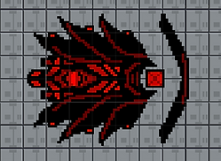
This project was primarily art-driven. I designed all 2D assets using a deliberate color language to make the hero and enemies instantly readable — the hero uses clean white and blue (purity, freedom), while enemies lean on red and black (aggression, threat). Even in fast-paced bullet hell moments, players always know who's who.
For the bosses, I designed visuals and mechanics together. Each boss's appearance reflects its gameplay identity: shield cores look shielded, turret bosses read as turret bosses at a glance. Weak points are visually obvious and consistent with the overall design language.
The three bosses follow a clear difficulty curve — Boss 1 focuses on positioning, Boss 2 introduces timing and target priority, and the final Mothership combines both while adding swarm pressure. The goal was simple: each fight teaches something new, and the finale makes sure you've learned it all.
UX/UR Design
(Balancing, User Research and Playtesting)
For UX, I did a lot of hands-on iteration through repeat playthroughs, user research, and playtests. I looked for places where players got stuck, misunderstood mechanics, or felt frustrated—and then adjusted the experience to reduce that friction.
Most of my changes were about making the game more readable and fair:
-
smoothing difficulty spikes so progression feels steady
-
adjusting control feel and combat pacing based on player behavior
-
improving moments where less-skilled players were likely to fail repeatedly
My UX goal was simple: the game should still feel exciting and challenging, but it shouldn’t punish players just because they’re not highly skilled at shooters.


